

First Map of America’s Food Supply Chain Published
Fast Company recently published an article introducing the first high-resolution food map of the U.S. food supply chain.
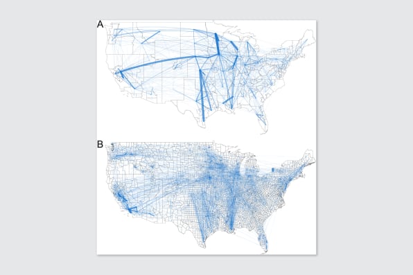
Recently developed by Megan Konar, a civil and environmental engineering scientist, and her team at the University of Illinois, this map depicts the flows of food, including grains, fruits and vegetables, animal feed, and processed food items between counties in the U.S. The map highlights the U.S.’s strong dependence on food that requires great distance to reach communities nationally.
Laboratories provided evidence for Konar and her team that analyzed and tracked where the food items were nationally shipped, the findings communicate the complex infrastructure behind America’s food transport system. Enlightening the public, this map shows how the whole American population is connected through the food system. Unveiling that many of the largest food transport links were within California, the map thoroughly illustrates the interconnectedness of food transport and the consumer lifestyle.
According to Konar, the transport of grain produced in the Midwest, for example, is exported through the Port of New Orleans and relies solely on the waterways of the Ohio and Mississippi Rivers for successful transportation. Hypothetically, if the infrastructure along these waterways were to fail, the total transport of grain, as well as the supply chains, would be rattled nationwide.
Proving a point, this map identifies how the majority of America is reliant on national food transport systems for sustenance and calls into question the self-sufficiency of American communities when it comes to food production and consumption on a national level.

EMAIL: [email protected]
I joined the Ka Moi team to learn about the journalism world and to be apart of a group of young Hawaiians with a powerful voice. I want to travel around the world after attending college and join the Peace Corps. I am passionate about solving social and environmental issues. I surf as much as I can and I enjoy running distance races for track and cross country. I wants to be able to look back on my life when I am older with no regrets or bitterness.
Ehulani L Stender • Nov 26, 2019 at 9:08 am
I think it is very intriguing that communities are not self-reliant and instead rely on exchange from other states in order to gain sustenance. This is very believable because I doubt the majority of us have gardens in our backyard and only consume food from there or even from a local farm. In the past, our ancestors achieved this ideal sustenance in communities that we have now lost.